The Elements of Web Design Part II: Comic Sans Criminals

Don’t forget to check out Elements of Web Design Part I from our continuing series on the web design process!
Thoughtful Typography
You wake up in a cold sweat, gasping for air. Glancing over at your alarm clock, you’re not surprised when you see what time it is… 3:00 AM. For the last two weeks, you’ve seen that same time on the clock every night, the mocking green light burned into your sleep-deprived retinas.
Your concerned spouse sits up, startled. Groggily, they ask, “The nightmare again?” You nod, still desperately trying to slow down the rapid pounding in your chest. You know why this is happening.
It’s all because of that sign.
If only you’d used a different font, maybe things wouldn’t have turned out the way they had… Perhaps they would have taken you seriously. Alas. It’s too late for regret now. What’s done is done, and there’s no going back.
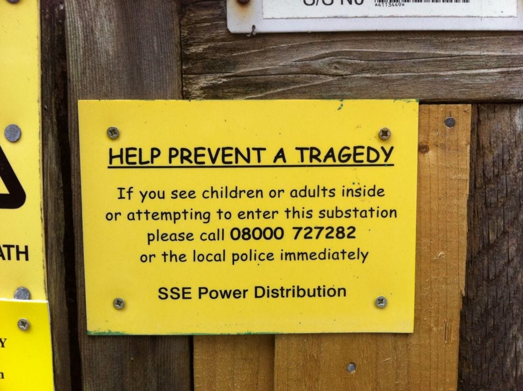
Meanwhile, somewhere in a volcano supervillain lab, Comic Sans gives its most evil chuckle.
Typography is serious business. Like images, the fonts you choose should evoke particular emotions, give hints about your brand’s personality, and show the world that you are a professional. That’s why web designers have been raging a war against the most ridiculous typeface ever created. While it makes sense for birthday clowns and toy stores (kind of…), brands can express that they are fun and creative without resorting to Comic Sans.
As far as general guidelines go for your typography, you have freedom of creativity as long as you keep the following in mind:
- Make sure it’s readable, which typically means larger than 16 pixels for body copy, with your headers and subheaders larger than that to break up the text into sections.
- Keep your typeface palette limited to 2 or 3 different fonts– One for headers, one for body copy, and an optional third for accents.
- Be sure that your body copy font choice is effortless to read. Historically, serif fonts (which are the ones that have little feet on them) are used in the body because it’s supposed to help guide readers through large blocks of text. That’s not a hard and fast rule, though. If you’re going for a more modern, clean look, it’s okay to pick a sharp sans serif option like Helvetica or Arial.
- Display fonts are those that are fun and bold. They tend to do the heavy lifting at setting the mood you’re going for. Limit their usage as an accent, and never use them for body text.
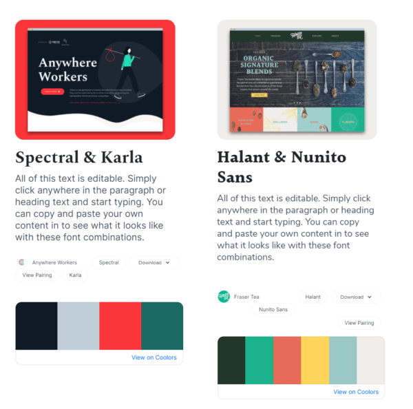
If you’re not sure what font set you think would work best for your particular industry or brand personality, tools like Font Pair give you options to play around with and color pairings that match the overall tone of the typeface sets.
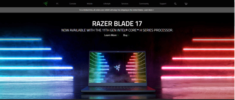
Emphasis on Big, Bold Images
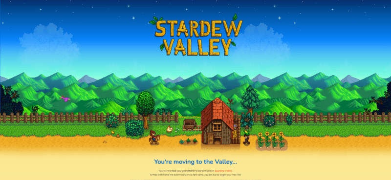
There’s a current trend in web design called “hero images.” It’s a large image at the top of the homepage, right under the navigation bar. It is the total focus of the page before you start to scroll. It typically contains a snippet of text, including the site’s name, logo, and a CTA or value proposition. You’ve probably seen them so often, you hardly notice them anymore… At least consciously.
In reality, web designers are conspiring against consumers to drive them deeper into a website by appealing to our natural inclination towards visual learning. In fact, 65% of people are visual learners, which means that we prefer to and are better at processing information if we can look at it than if we hear it (auditory) or get our hands on it (kinesthetic).
That’s why Ikea furniture comes with labeled diagrams. Sure, some people would do fine listening to someone else explain how to put it together, and a few might be able to put it together just fine by jumping right in with no instructions. Still, the vast majority of us need visual input before we understand the scope and sequence.
The whole point of a hero image is to present a compelling reason for why the visitor should stick around and learn more about you. It should be stimulating, engaging, and give a little taste of what they can expect from your site. In practical terms, visual storytelling has been shown to generate 94% more views than sites that don’t emphasize images. Better yet, that’s the case, no matter what the topic or industry is. Pictures work.
Informative, Entertaining Content
So, you’ve just listened to me wax poetic about the value of pictures, and I stand behind it. But that doesn’t mean you can neglect content. Even photographers, who are quite literally in the business of visual storytelling, have to drum up some content that explains why the service they offer is worth the price, the relevant experience they have, and what they bring to the table.
Pictures are like your appetizer, maybe a nice spinach-artichoke dip or some fried pickles for the table, while content is the 16 oz ribeye, grilled medium-rare and served with a side of cheese fries and garlic bread. Once your visitors have indulged in the aesthetics, they need something hearty that will make them want to do business with you.
Text, informational videos, product descriptions, and infographics can all play a part in your overall content strategy. No one particular method will work for every business, and no content creator will be skilled at creating each type. You have to figure out where your skills lie, what your audience wants, and how to meet in the middle.
No matter how you present content, though, there are a few “Golden Rules,” as summarized by Chron:
- Simple is best
- Keep it short
- Use strong words
- Make phrases search-friendly
- Use headers
- Stay informal
- Use plain English
- Make it scannable
- Use appropriate images
- Grammar check
Most importantly, though, be sure that it reflects who your brand is. No one reading our content is ever going to think, “Boy, howdy, those are some serious, all-business sons ‘o guns. They’re buttoned-up, straight-laced, and very much enjoy tax audits and smooth jazz.” And we don’t want them to think that! That wouldn’t accurately represent how we approach our work, and it wouldn’t attract the kinds of client relationships we thrive within.
We want people to know that we’re pretty goofy, but we know our stuff. That’s what matters to us. Make sure your content shows what matters to you.
Accessible for All
I don’t know if you’ve heard, but the internet is pretty popular. People from all walks of life use it as a lifeline to access information, do complex tasks, and binge-watch 13 seasons of Cutthroat Kitchen. That’s why accessibility is so critical. When visitors can’t use your site right away, they’re not going to work terribly hard to get around those issues. They’ll go searching for a different business that has what they need and doesn’t make them overthink to get it. 69% of people living with a disability will immediately leave a website if it’s not accessible.
Legally, any state, federal, or local government is required to meet Rehabilitation Act Section 508 requirements, which “requires federal agencies to develop, procure, maintain and use information and communications technology (ICT) that is accessible to people with disabilities – regardless of whether or not they work for the federal government.”
While no such laws exist for non-government sites, plenty of lawsuits have claimed that a public-facing site is a part of “Public Accommodations and Commercial Facilities.” By restricting accessibility, a site violates ADA guidelines. No official laws require public sites to conform to ADA guidelines, but that time may be on the horizon.
Apart from legal requirements, you should want everyone to be able to use your website. Discrimination is not a great way to get a large customer base. Plus, it’s just not very nice.
In general, your website design needs to meet specific criteria that allow people with disabilities to reasonably use the site with specific accommodations. These standards are outlined in the Web Content Accessibility Guidelines, which were last updated in 2018 and will be revamped later this year. For now, take a look at the WCAG quick reference guide, which outlines “success criteria and techniques.”
You can also run your site through the SiteImprove Accessibility Checker to get a head start.
One of the absolute most extraordinary accessibility platforms I’ve ever come across is on the Poketo website. They have a pop-out menu with many options that let everybody adjust the entire site according to their specific needs. I’ve never seen it on a webpage before, but I have a feeling it’s going to continue to grow as web accommodation guidelines expand.

User-Friendly Navigation
Since the time of the ancient Greek philosophers, one question has plagued the keenest of minds and puzzled academics worldwide. Even Shakespeare’s whiny Danish prince Hamlet posed the question that continues to spark debates to this day: “To hamburger or not to hamburger?”
By hamburger, we’re actually talking about a hamburger navigation menu. Three lines indicate it– bun, patty, bun– that universally represent the spot you click to access the site map. It first cropped up in 1981 by a software designer at Xerox but rose to fame when mobile responsiveness became a big deal. Many websites, including our own, have a standard navigation menu at our desktop site but swap that out for a hamburger on our mobile site.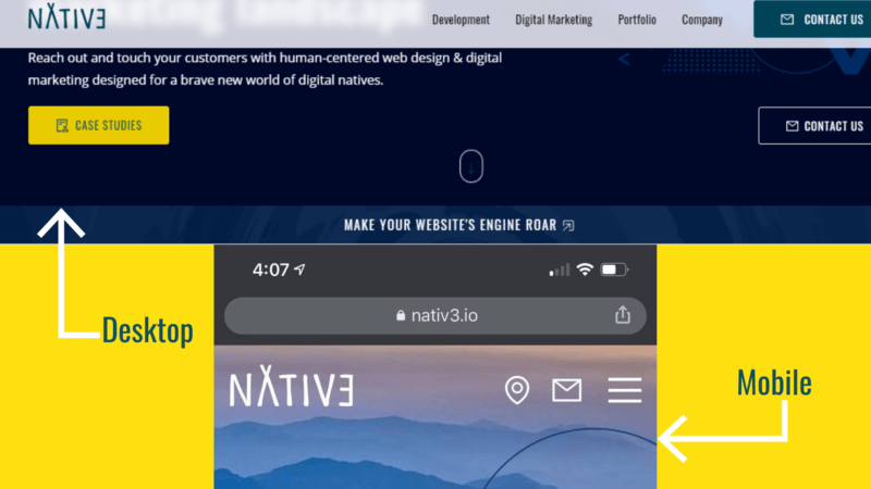
This simple navigation tool helps visitors quickly find what they’re looking for without cluttering up your limited mobile site space with a full menu. The clean lines and minimalistic design don’t interfere with your overall aesthetic, and it’s an easy-to-push option that makes sense on small screens.
Even Google Chrome uses its own version of the hamburger menu, swapping out the three lines for three dots (perhaps a snowman menu?), but evoking the same connotation with users.
Some web design experts reject the ‘burg, claiming that it tucks vital information away that visitors have to think about to find. It may be valuable to your site to A/B test the hamburger menu and see how your visitors respond to both options.
NATIV3 Knows Web Design
You know the elements, you’ve picked your hero image, and you’re not going to use Comic Sans. But where do you go from here?
If we may be so bold, we recommend you go over to our contact form and let us know your website vision. We’re digital natives who are passionate about helping businesses, causes, and candidates across industries.