Elements of Web Design, Part I: Gathering of the Juggalos

Visiting a poorly designed website is kind of like attending a Gathering of the Juggalos sponsored by Insane Clown Posse, LLC. There are too many colors, everything’s confusing, and you’re pretty sure whoever put this shindig together imbibed a little too much Faygo.
Well, my friends, today we take off all the clown makeup, put down the bottle of Jazzin’ Blues Berry, and figure out how magnets… er, the elements of web design work.
Mobile-Friendly and Responsive
Phew, after all of that partying with the ICP, it’s time to reinvigorate our brains with a little math problem. Grab your calculators and pencils…
Jimmy knows that 57% of internet users claim that they won’t recommend a business with a poorly designed mobile website.
His friend Rosa recalls that 85% of adults think that a brand’s mobile site should be just as good or better than the desktop version.
Rosa’s third cousin Phillip just butted in and reminded both of them that 56% of all web traffic is mobile.
So, what are the chances your non-responsive website is driving customers away?
While that lady tries to figure it out, we’ll just estimate to save time: A pretty high chance.
So, what exactly is a responsive website?
Basically, it just needs to be ready for any device that it’s viewed on. No matter what the dimensions of the screen, a truly responsive site should be ready to snap to the size that makes for the best user experience.
In the past, businesses would were early adopters of mobile would simply build mobile-specific sites that required an entirely different set of code to render appropriately. Responsive sites let you save time, energy, and effort with One Site to Rule Them All.

You can check how responsive your site is with the Responsive Design Checker tool.
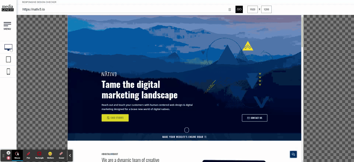
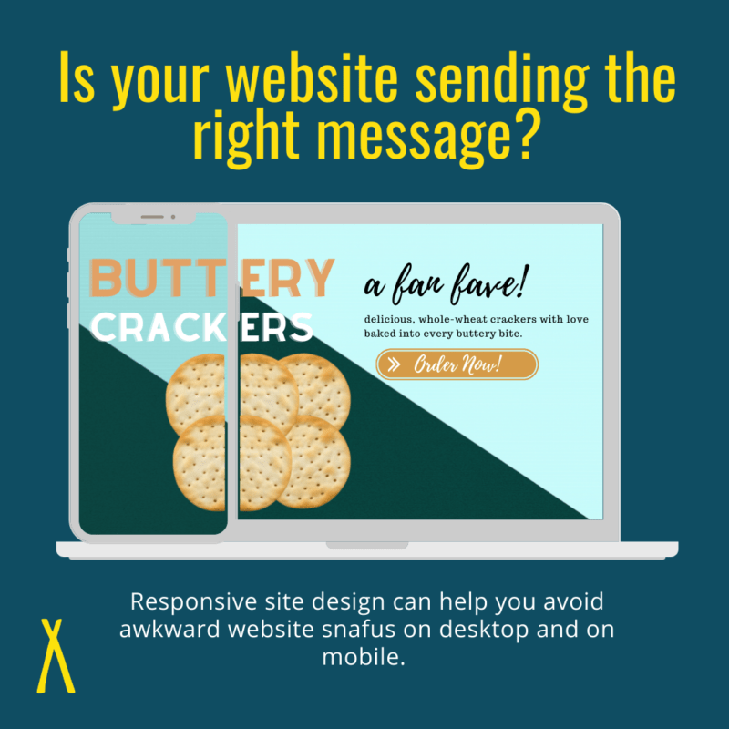
Type in any URL, then use the sidebar to see how it looks on a variety of devices. Being proactive can help you avoid the ol’ “Does this company sell Butt Crack or Buttery Crackers?” quagmire.
Clean, Minimalistic Design
A busy, distracting site isn’t going to do you any favors. It hides all the good stuff underneath elements that your visitor won’t even notice before they’re clicking the back button.
Minimalism is incredibly helpful for cutting through the information overload most modern web surfers (do we still use that term?) experience. Everything and everyone is trying to sell folks something, so you’ve got about 50 milliseconds to make a good impression.
No matter who you are or what your site is about, minimalism is the name of the modern website game.
This choice goes beyond aesthetics, though. Scientists have spent years studying the way that people’s eyes naturally move over a page– whether it be in a book or on a website. Web designers can use eye-tracking tendencies to place the most important information they want visitors to notice or to break that natural flow by placing engaging content outside of the “hot zones” created by F- and Z-pattern tracking.
F-Pattern Tracking
The most common way for people to scan a page is in an F-pattern.
When a site is informationally dense, with many elements to explore, people will generally follow this process:
- Users first read in a horizontal movement, usually across the upper part of the content area. This initial element forms the F’s top bar.
- Next, users move down the page a bit and then read across in a second horizontal movement that typically covers a shorter area than the previous movement. This additional element forms the F’s lower bar.
- Finally, users scan the content’s left side in a vertical movement. This last element forms the F’s stem.
You can capitalize on this by making smart decisions with your minimalistic layout:
- Put your most important information at the top, in the first two paragraphs.
- Use headings that are bigger and bolder than the surrounding text.
- Put related information into groups or clusters on the page.
- Employ color and typeface to engage readers throughout your content.
- Don’t be afraid of bullets or numbered lists.
Z-Pattern Tracking
On pages that are less visually complex, people are more likely to follow a Z-Pattern. It’s typically seen on landing pages, where the desired user action is clicking a button, submitting a form, etc.
The process, unsurprisingly, follows the basic shape of the letter Z:
- First, people scan from the top left to the top right, forming a horizontal line. This space should be all of the main components that you want your visitors to hone in on first.
- Next, down and to the left side of the page, creating a diagonal line. This diagonal line should give more information that a visitor should see before completing your CTA.
- Last, back across to the right again, forming a second horizontal line. This basically creates a Texas-sized “CLICK ME” line to your final CTA.
“But dear author…,” you say with a smug grin, thinking you’ve found a previously unforeseen loophole to this rule, “What if it’s something so whimsical… so incredibly silly… that minimalism just won’t work? What if my business hosts birthday parties for hamsters? Hmm? What then?”
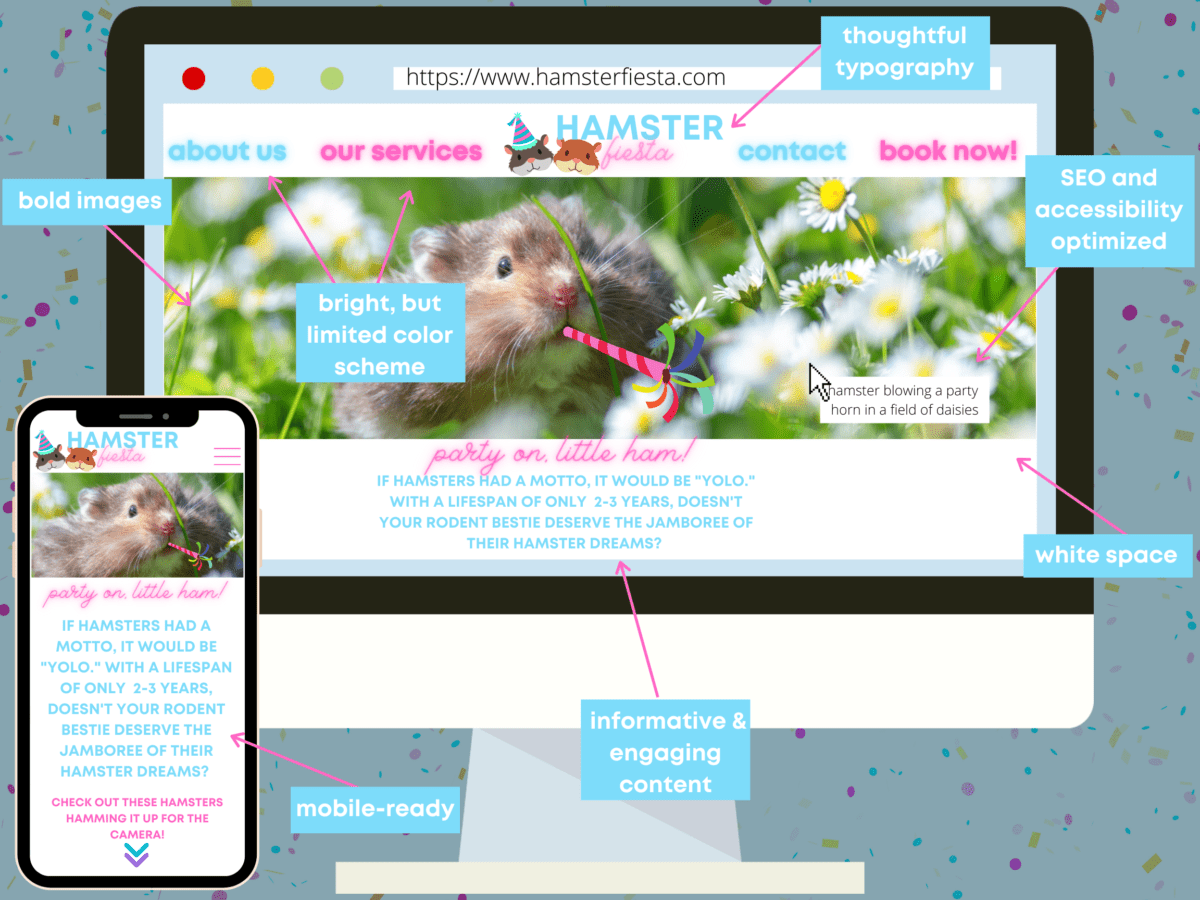
That’s right. Even the most absurdly eccentric businesses out there making tiny hamster party hats can express their quirkiness while maintaining the fundamental element of good design.
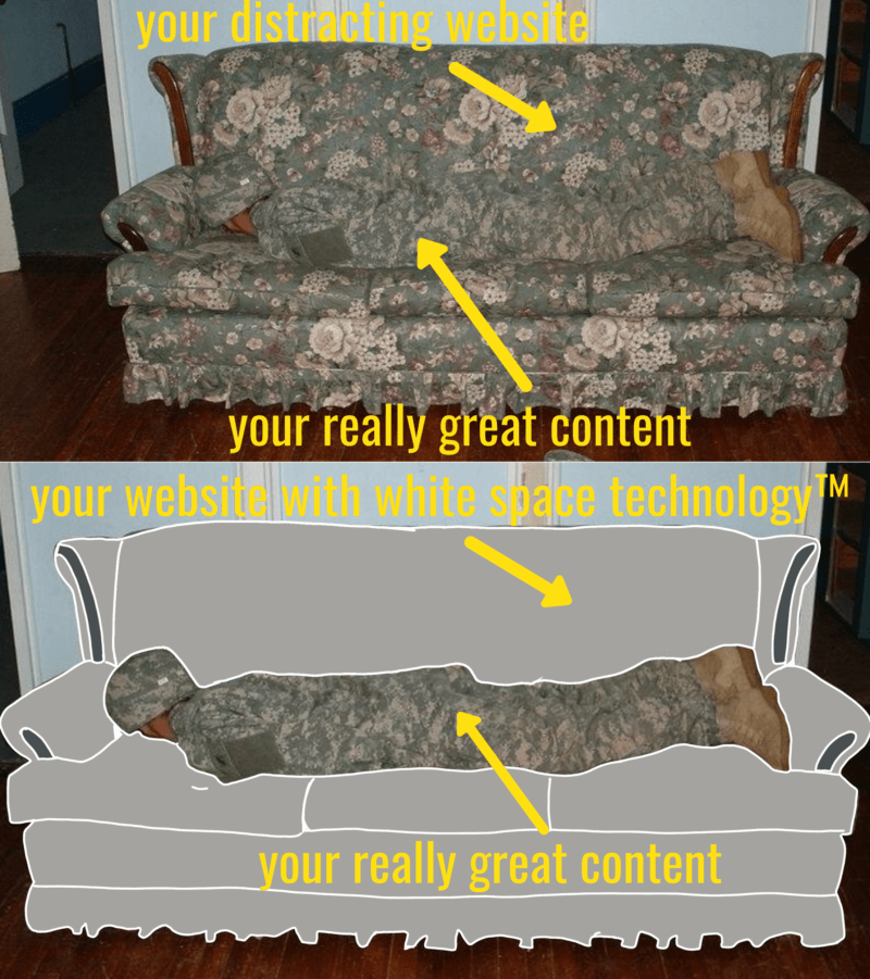
Liberal Use of White Space
Perhaps the most important aspect of minimalism, other than your collection of tasteful turtleneck sweaters in a variety of neutral colors, is the use of white, or negative, space.
Don’t be fooled though! White space doesn’t have to be white, nor is it negative!

All of the areas of your page where you don’t have something– an image, content, an icon, whatever– is considered white space. Unlike the websites of yesteryear, where we followed the newspaper rule of “Keep it above the fold,” modern web design encourages you to spread things out and give all of your elements a little more breathing room.
Why the emphasis on this element of web design in particular?
- It creates a natural flow through your webpage because each element stands out in stark contrast to the background.
- Negative space forces you to get rid of any unnecessary content or features and to emphasize the things you actually want people to notice.
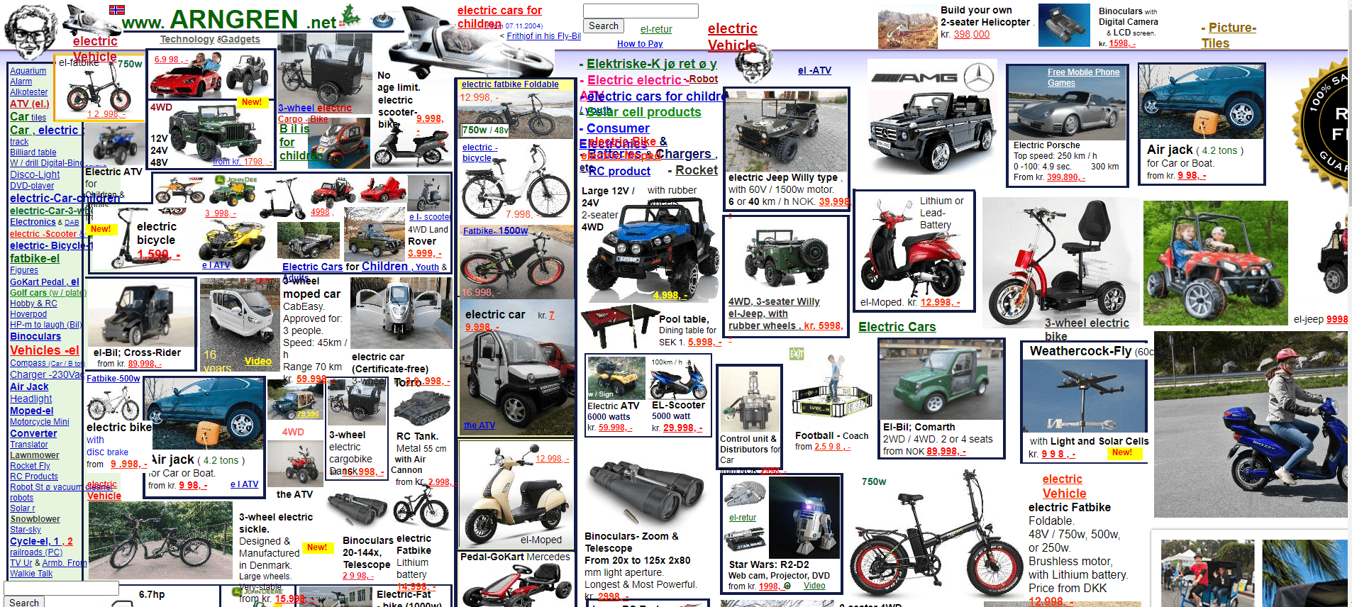
- It stops your site from looking like this Norweigian version of Craigslist, AKA the stuff nightmares are made of. And yes, it still looks like this in the year of our Lord 2021.
In summary:
Considerate Color Scheme
You guys ever heard of sports games? It’s where a ragtag group of pals gets together to punt home runs and dribble pitches, but they do it wearing fun matching outfits.
Admittedly, everything I know about this topic came from the song Sports Go Sports by Garfunkle and Oates, but the important thing here is the matching outfits.
If I were to show a football fan a black and gold football jersey with no other discernable logos, text, or images, they would most likely be able to tell me it’s from the New Orlean’s Saints. That color combination is so deeply rooted in the team branding and fan culture that it becomes an almost subconscious fact that black and gold = New Orleans Saints.
That’s backed up by scientific studies, including one from The Association for Consumer Outreach, which notes that color increases brand recognition by 80%.
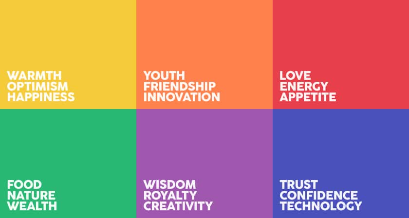
Color plays an almost primal role in human understanding of the world. You exist today because your ancestors figured out that the red berries over there will make you vomit yourself to death, but those blue ones definitely won’t do that.
Even animals have adapted with certain palattes to send messages, like “Hello, please don’t eat me, for we will both perish.” This is called aposematism, and we see it in species like dart frogs and wasps. Reds, yellows, and oranges are particularly popular choices.
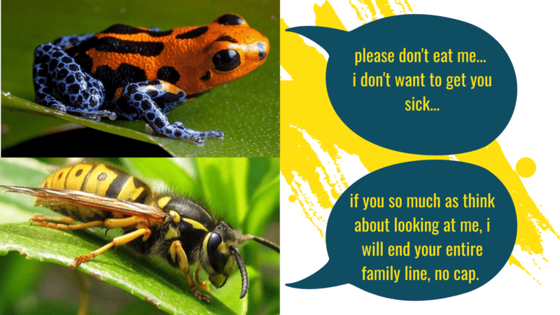
We see those same colors put to use for humans in the form of stop signs, caution tape, and wet floor signs. Colors have power.
That’s why it’s so important to have restraint when choosing your brand’s color palette. It puts in the lion’s share of work helping your visitors feel what you want them to feel, notice what you want them to notice, and perceive your brand the way you want them to perceive you.
A good starting point for your color palette is demonstrated below:
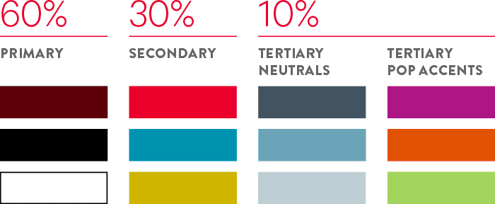
Start with three colors, with at least one being a true neutral. That should make up the bulk of your site content.
After that, you can bring in brighter bursts, then tertiary neutrals, which are just shades and tints of your primaries and secondaries.
Finally, you can have some tertiary pop accents, but just as a treat. These are bold, bright, and reserved for special occasions. Think of them as Milkbones (if you’re a dog) or Milano cookies (if you’re me).
Sites like Coolors can help you find starting point combinations that you can customize to your liking.
We’re Not with the Elements of Web Design Done Yet!
We’ve still got 6 more elements of web design to get through, packed full of funky fresh memes and helpful tips for making your website way more radical.
Stop back by the NATIV3 blog next Wednesday to wrap up the elements of web design. In the meantime, if you start missing us too much, you can fill out our contact form to get in touch with web design experts who can help you navigate the digital landscape.