The Psychology of Marketing and Color Theory, Part II

Serene blues, passionate reds, and dreary greys. Brands understand that colors have power, which is why so much time goes into researching and developing palettes that evoke the emotions they want their customers to experience. An article from Digital Information World found that 93% of consumers “reported focusing on visual appearance when buying a product,” lending a number to the staggering weight that color can hold when it comes to purchasing behavior.
Even the smallest nuances in shade, tint, or hue can create major mood changes, which explains why when major companies decide to shift their color spectrum, it can be a bit disorienting and uncomfortable. In fact, common practice branding guidelines insist that the only time it’s appropriate to complete redo your palettes is when you’re undergoing a re-branding or relaunch. Otherwise, “unexplained changes to color can lead to lost sales and confused consumers. Consumers often define a brand first by color.”
So, when it comes to creating your brand’s color story, it pays to understand the range of functions that each tone can have. If not, you run this risk of sending the wrong message, or worse, leaning on passing color trends instead of age-old consumer data for one of the most impactful aspects of showcasing who your company is. While we’re no color psychologists, there are some tried-and-true rules that you can use as a jumping off point for building a palette that works for your brand’s personality. In this follow-up to last week’s blog on palette building, we’ll look more in-depth at the message that particular colors send (both positive and negative), as well as examples of well-known brands who are associated with those colors.
Let’s dive in:
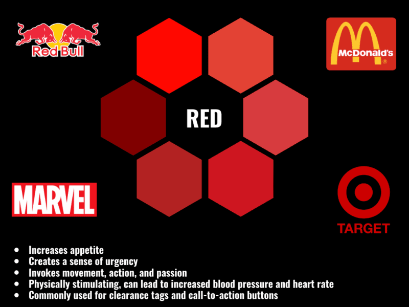
Red
Bold, passionate, and eye-catching, red is often used to incite action. While it is often used to communicate excitement and urgency, it can also be used to create a sense of danger. Color psychologists consider red the most intense color, and the one that is able to produce the strongest consumer response.
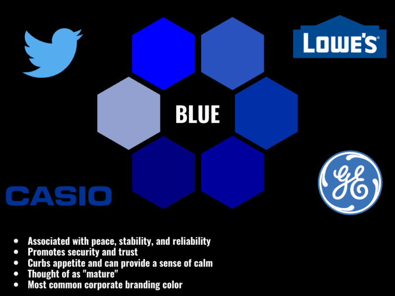
Blue
Commonly associated with water, purification, and cleansing, blue is the color that brands frequently turn to for feelings of peace and serenity. The insides of shops are often painted in soft blues, as they help customers feel calm during their time in the store. It is also a confident color, so it’s common for big name brands to feature this hue prominently.
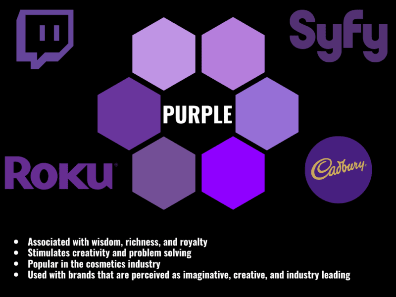
Purple
Rich, opulent, and successful, purples tell consumers that you are a brand to be reckoned with. It’s often used with luxury brands because of its history of being associated with royalty. At the same time, though, it is also frequently seen in creative, “quirky” brands that appeal to niche areas, like the purple Twitch and Discord logos for gamers. Lighter purples are also used in cosmetics, spas, and anti-aging products.
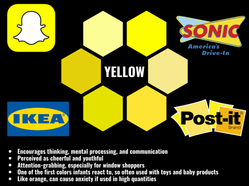
Yellow
Bright, cheery, and full of optimism, yellow is another warm color that conveys a sense of well-being and confidence. Like its counterparts red and orange, it can also be overused, stimulating the brain to a cautionary response. It’s not uncommon to see yellow tempered with a soothing blue or toned down to a pastel, allowing it to evoke the positive reaction without also evoking consumer anxiety. Interestingly, yellow has one of the longest wavelengths, making it one of the first colors that very young babies can process.
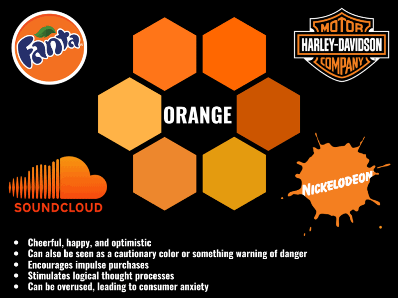
Orange
Orange is a happy color, when used in moderation. It maintains a youthfulness and optimism, while still being a bold brand palette choice. Like red, it’s pretty common for sales, calls to action, and other “urgent” messages to be orange, as it is shown to communicate value and affordability. It’s frequently seen in thrift stores and discount shops.
Green
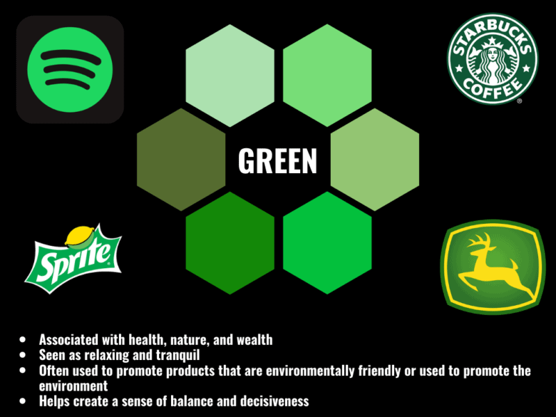
Green is soothing and nurturing, used by brands to represent a gamut of ideas. On one end of the spectrum, green brings to mind images of nature, the environment, freshness, and youth. On the other side, it can represent wealth, wisdom, and clear-thinking. Financial firms and environmental causes alike opt for green branding, showing just how versatile the color can be when it comes to symbolism.
Putting Color Theory Into Action
What colors can you associate with your brand? What message are you trying to send to your customers? These are big questions, and ones that can influence more of your brand’s success than you realize. Next week, we’ll walk you through the process of creating and applying your brand’s new palette by combining the tenets of color theory that we discussed last week with the data-backed perceptions of color we explored this week. Then, “hue’ll” be ready to set the “tone” for your brand!