The Psychology of Color Theory and Marketing, Part I

%Feeling blue? Or red…pink…yellow…green… Whether we realize the impact or not, colors play a nearly unbelievable role in our choices as consumers. Of course, we all have color preferences. I’ll buy pretty much anything as long as it’s pink. But the psychology behind color theory and its role in marketing is much deeper than that.
In fact, according to Design Wizard, the experts behind the graphic design software of the same name:
- Colors alone can influence up to 90% of an initial impression.
- People perceive colors differently depending on their gender and culture.
- Blue is the favorite color of 35% of women and 57% of men.
- Color influences 85% of shoppers’ purchase decisions.
- Colors increase brand awareness by 80%.
- Colors affect people’s behavior, mood, and stress levels.
- 93% of shoppers focus on visual appearance alone when they consider a purchase.
Those numbers are nearly unbelievable, but mostly because we don’t really notice the impact. But, if you stop to think about the things you are drawn to as a consumer, you’ll probably start to notice a pretty clear pattern. From the clothes in your closet to the websites you frequent, there’s likely a common color palette that you stick with.
So, why exactly does the color of something play such a huge part in whether or not we make the purchase? Let’s start with the science behind color theory.
The Psychology of Color
As far back as ancient Egypt, people have been pondering what makes color so special and how it affects both ourselves and others. Egyptian texts have been found in which they ponder over color’s effect on moods, as well as “prescriptions” to observe or use certain colors to achieve better health.
Later, in the 17th century, Sir Isaac Newton, most often noted as the first person to explain the laws of gravity, also discovered that when light passes through a prism, it is scattered into seven different key colors: Red, orange, yellow, green, blue, indigo, and violet.
Using this basic concept, he went on to create the foundation for the modern color wheel, which further sorts those main colors into darker and lighter hues, tints, and shades.
That fundamental color wheel has become the linchpin of modern color marketing. Using the concept of color harmony, in which certain colors look best together due to their placement on the color wheel, brands can create marketing palettes built to evoke certain emotions simply based on the guidelines of color harmony.
Today, color psychologists use the tenets of color theory and color harmony to study the way that color affects our understanding of the world and our behaviors. For our specific industry, we mainly consider how color is going to impact the impression that our audience has of our brand and which specific groups of people a brand’s colors are able to attract.
While it’s clear that there is a science to color theory, it’s also important to note that, just as with any marketing strategies we consider, personal experiences of consumers and context of the marketing plays a major role in how it’s perceived.
For example, it’s been said that red is meant to make you hungry, which explains McDonald’s color choice. At the same time, it’s supposed to indicate alarm and urgency, like when you see a stop sign, but most people don’t drive away from an intersection craving a cheeseburger. Still, it’s pretty clear from our everyday experiences that color has something to do with our consumer choices, so your best bet is to keep theories and studies in mind when making decisions about your brand’s palette.
Building Palettes
While there are tons of resources online for auto-building color palettes according to color theory, there’s a lot of value in understanding the process, so that you can ensure that it’s communicating the exact message your brand is looking for.
A good starting point are the 9 rules of color wheels.
Rule #1: Primary Colors
Primary colors can be thought of as the most basic colors, but they are also the three colors from which every other color exists. Certain ratios and mixtures come together into a virtually infinite number of palettes. The primaries include red, yellow, and blue.


Rule #2: Secondary Colors
Orange, green, and violet make up the secondary colors, or the colors created when the primary colors are combined. Red + blue = purple, yellow + blue = green, yellow + red = orange.
![]()
![]()

Rule #3: Tertiary Colors
By mixing together two secondary colors, you end up with the three tertiary colors. These are typically pretty drab, as they actually consist of three colors mixing together, hence the name. For example, when we mix orange and purple, we are actually mixing two parts red with one part blue and one part yellow. The tertiary colors are brown (orange+violet), slate (orange+green), and olive (green+violet).


Rule #4: Intermediate Colors
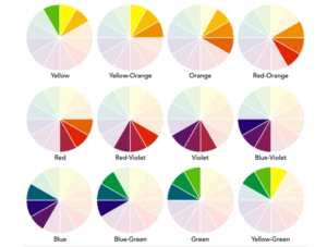
When you mix a primary with secondary, you end up with the intermediate include red-orange, yellow-orange, yellow-green, blue-green, blue-violet, and red-violet.


![]()
Rule #5: Complementary Colors
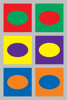
Complementary colors are those that are across from each other on the color wheel. When two complementary colors are mixed together, they essentially “cancel each other out,” creating greys and blacks. These colors have the strongest contrast to each other, and are often used in conjunction. Red and green is a common Christmas combination, the LSU Tigers are known for their purple and gold uniforms, and the New York Knicks sport orange and blue jerseys.
Rule #6: Monochromatic Colors
When you add white or black in various amounts to colors, you create a spectrum all based on a single hue. For example, lightening a hue with different proportions of white creates its tints, while darkening a hue with different proportions creates its shades. Monochrome schemes are a common way to start a color palette.

Rule #7: Analogous Colors
Another common palette starter is working with analogous colors. This scheme consists of three colors that are next to each other on the color wheel. Elle Decor describes it as, “…composed of one dominant color (usually a primary or secondary color), then a supporting color (a secondary or tertiary color), and a third color that is either a mix of the two first colors, or an accent color that pops.” Analogous colors are seen as harmonious and serene.
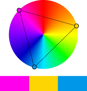
Rule #8: Triadic Colors
Triadic colors are considered to be very vibrant color schemes, even when you are using lighter tints. They consist of three colors spaced evenly around the color wheel, creating an interesting mix that has to be carefully balanced when they are being used as a brand palette. One color should dominate, while the others are used as accents.
Rule #9: Tetradic Colors
Finally, tetradic color schemes are bold and aggressive. They consist of four colors spaced evenly around the color wheel, which can create an incredibly strong contrast. In a tetrad, there is no one, dominant color like there is in an analogous or triadic scheme. Instead, all four colors dominate, so careful thought of how you want to arrange your hues is important.

Ready to Apply Color Theory?
Now that you understand the ways that professionals think about colors, palettes, and good rules of thumb, we can dive into the way that these specifications are used to create everything from photographs to living room layouts. We’ll start next week by exploring the ways that colors can make people feel, and brands that use color studies to influence brand perception. Then, we’ll wrap up with a step-by-step tutorial for creating, implementing, and owning your own brand’s palette.