What is Mobile First Indexing?

One of Google’s greatest assets is its ability to quickly and accurately adapt to user trends. It should come as no surprise, then, that mobile first indexing is making major strides in becoming Google’s number one concern.
Mobile browsing is quickly overtaking desktop browsing. From 2016 to 2018, that percentage shot up from 57% to 63%. Time spent on a site when using a mobile device rose 9 percentage points, and the bounce rate fell from 52% to 47%. Mobile is rapidly becoming your customers’ favorite way to browse.
The obvious question then becomes, “What is mobile first indexing, and what does it mean for my business?” Let’s go over what this new paradigm for SEO could mean for you, how it differs from what we were doing before, and real steps you can take in the right direction.
What is Mobile First Indexing?
Let’s start even simpler than that. When we’re referring to Google, what is indexing? Simply put, it’s the process through which the search engine adds your pages to their search results. When you create and publish content, Google “crawls” through it, along with all other content that matches a particular search term, and decides whether or not it’s worthy of showing up to searchers.
That should makes understanding mobile indexing even easier. Instead of using your desktop site to decide whether or not to index your page, Google uses your mobile site first. According to Moz, “If you monitor crawlbot traffic to your site, you may see an increase in traffic from Smartphone Googlebot, and the cached versions of pages will usually be the mobile version of the page.”
That doesn’t mean, though, that not having a mobile site eliminates you from rankings. It does mean that it may negatively affect you, and that other businesses with mobile sites will likely have preferred ranking if they are following basic SEO rules.
So, What’s the Difference?
In the past, Google used your desktop page as its primary indexing reference, or the “primary version.” The mobile site was treated as an alternate version of your site, often with its own URL (m.website.com).
The desktop version of the site was the one that held the entire canon of what the website had to offer, while the mobile site featured only the most important aspects. Content was not as present, structuring and layout were simplified, and external links were disposed of for the sake of simplicity.
Now, the opposite is true. Your mobile site will become the most comprehensive version of your site, at least in Google’s eyes. That means you might be in for some major changes in the way you structure your mobile UX/UI, as well as your SEO practices.
Implementing Mobile First Indexing
If you’re starting to get worried, relax. Google is only rolling this out to sites it thinks are ready for these big changes. In a recent Google Webmaster Central Blog post, they said, “We’ll continue to carefully experiment over the coming months on a small scale and we’ll ramp up this change when we’re confident that we have a great user experience.”
So, what can you do to get ready? Google recommends these steps:
- If your mobile website is already comprehensive and responsive when compared to your desktop site, and you’re happy with your rankings, you don’t have to do anything. You should be ready for these changes.
- Ensure that you’ve added and verified the mobile version of your site in the Search Console.
- Test your robots.txt with Google’s robots.txt tester. This will help ensure that the GoogleBot is picking up the mobile version of your site when it is data crawling.
Further, you can begin to reshape your content and SEO strategies with mobile first indexing in mind.
- Ensure that all media is available on your mobile site. Give all images alt-attributes and begin implementing all of your content into the mobile version.
- Take the time to give all pages well-written meta descriptions. These play a huge role in your content getting picked up by GoogleBot. In short, be sure that the following requirements are being met:
- Include your keyword
- Write real, comprehensible sentences that let readers know your site isn’t a scam
- Between 130-160 characters long
- Different on every page
- Be sure that all of your social media shareable buttons are easily accessible from your mobile site. You want people tweeting and posting about you. Don’t make it more difficult than it has to be.
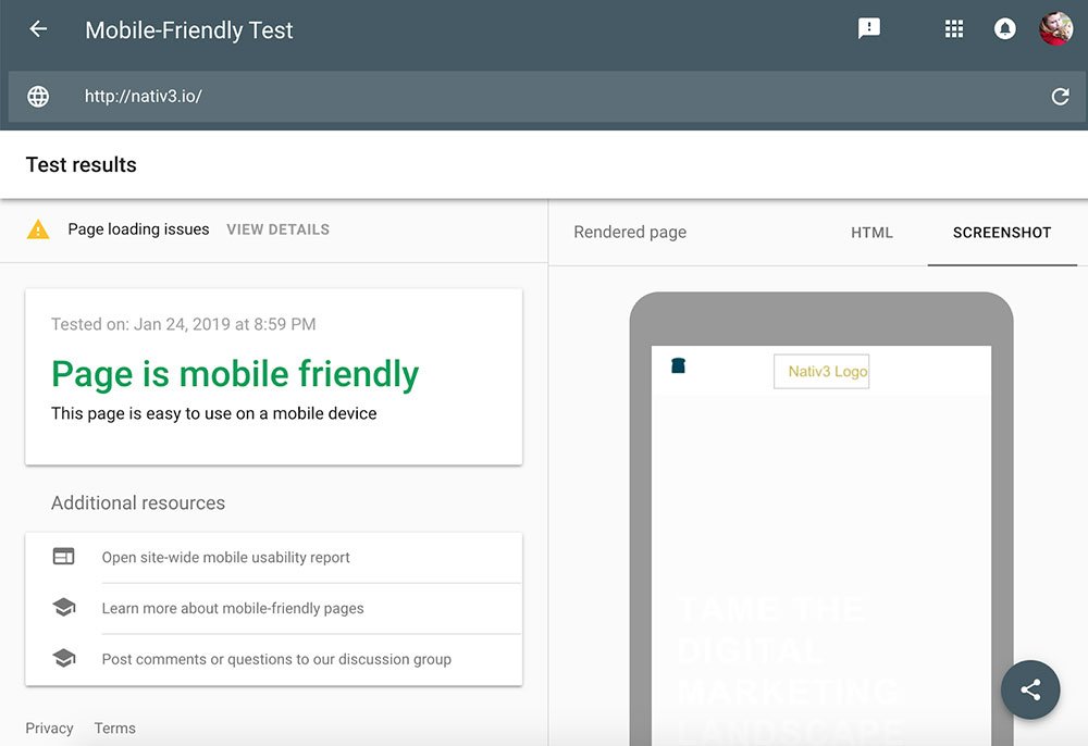
- Take Google’s Mobile Friendly Test to ensure that your site is hitting all the right buttons for you to show up on Google’s SERP.
- Go through your content and rewrite it. It’s going to take some work, but shortening sentences and paragraphs can make your readers want to stay on your page longer. Mobile browsing is a sign of the times. We’re always on the go, which means a quick (but well-written!) read is going to bring you better results.

Most importantly, don’t panic. There’s plenty of time to rework aspects of your desktop and mobile site that will up your rankings well before Google rolls mobile first indexing out for all search results. Take your time and stay focused on excellent content and SEO practices.