Mobile Site Development vs. Desktop Site Development

When setting up your business website, should you focus on mobile site development or desktop site development?
The real answer is both.
Desktop Site Development
When designing a site for desktop browsing, you have the luxury of space, a more patient audience base, and mouse usage, which provides more precision for clicking.
Desktop Sites Offer More Space for Both Text and Graphics
Typically, laptop and desktop monitors can measure anywhere from 10.5 to 27 inches diagonally, offering a massive viewing area with plenty of room for text and graphics without feeling crowded.
That means that your font size can be smaller, which lets desktop site developers fit more information onto individual pages, as well as the opportunity to use pictures and graphics as visual centerpieces.
Screen size differences also mean that there are more options for UX elements that aren’t necessarily going to work well on mobile, like non-collapsing sidebar menus, expanded navigation, and auto-populating suggested readings at the bottom of a blog post.
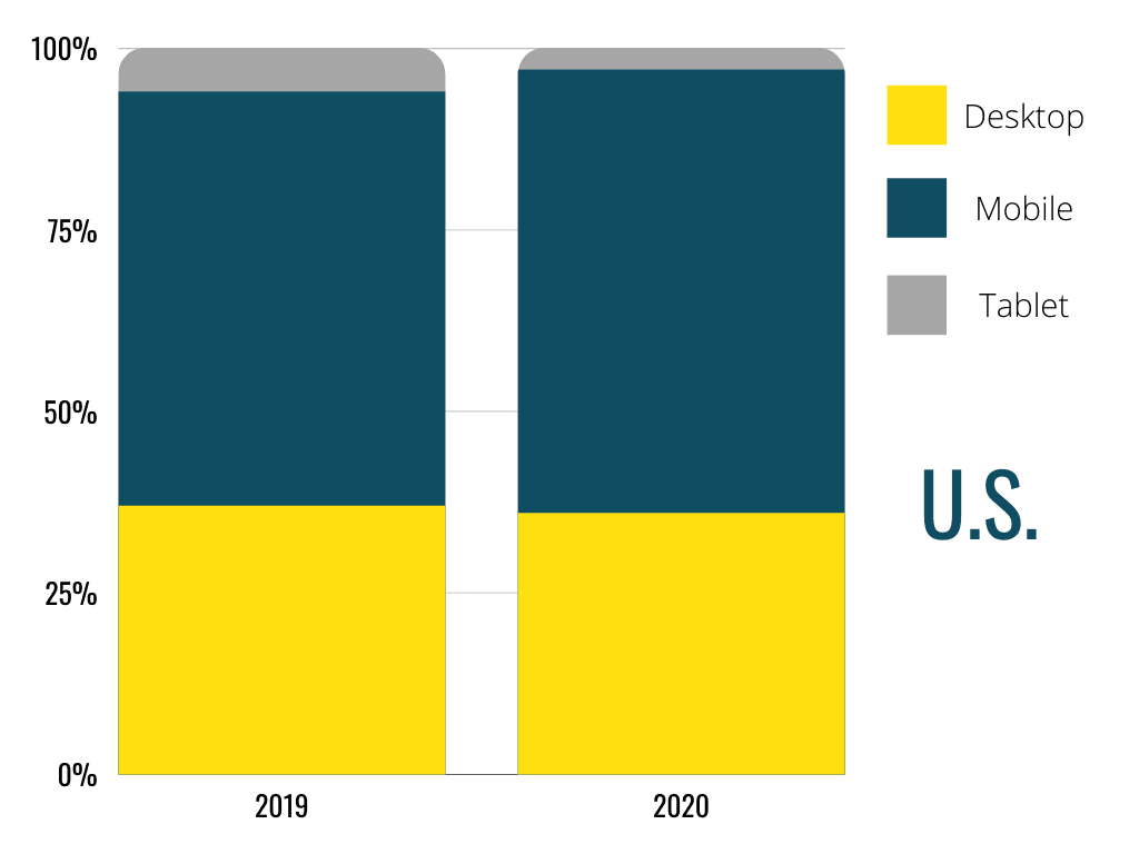
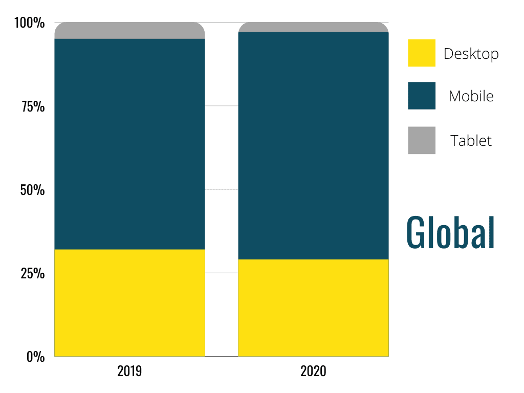
Time Spent on Site Increases, Creating More Leeway for Desktop Site Developers to Play with Content Organization
While mobile browsing may be the most popular way to access websites, desktop sites keep visitors around for longer:
When we use desktop sites, we’re typically sitting, intending to spend some extended period engaged in our activity, whether it be research, shopping, or general leisure reading.
That gives site owners and the desktop site developers they hire more leeway when inviting users to spend time looking around.
For example, it opens up the opportunity to share exciting images without losing critical text real estate. Content organization, while still important, becomes less of a challenge in that you can fit more crucial information into the viewing space without fear that your audience is going to scroll right past it before they even notice it’s there.
Precision Mouse Clicking Offers More Options for On-Site Functionality
The use of a mouse increases precision significantly when you stack it up against touch inputs. That means that desktop site developers can implement code for hovering, right-click menus, and create visual feedback as a means of communicating what’s happening on screen.
For example, a mouse cursor will turn into a text insert marker when you click in a text field, letting users know that the site is ready to accept input from them. Links on a desktop site page will turn a different color once clicked, indicating that the reader has already visited that page. Right-click menus allow for shortcuts that make browsing more efficient.
Tasks like copying-paste and selecting chunks of text are also much more straightforward, creating more opportunities for users to share URLs quickly and easily. This is especially useful with the continued rise of text and messaging apps being integrated as part of the overall desktop experience, i.e., Facebook Messenger and iMessage.
Mobile Site Development
Mobile sites have made tremendous gains as the importance of responsive mobile site development becomes increasingly apparent. Limitations of space, functionality, and precision mean that mobile site developers have to get creative when it comes to creating relationships between a site and its viewer.
For reference, when referring to mobile sites, we’re really talking about one of these four types:
- Mobile-dedicated sites are specifically designed for mobile as a separate entity from the desktop site.
- Web apps are mobile sites that look and function like an app, but from a mobile browser
- Responsive-design sites auto adjust in response to the specs of the device used to view them
- Full sites are not optimized for mobile and instead appear as the entire desktop site
Smaller Screens Creates Challenges for Sizing and Accessibility
While “phablets,” or phone tablets, offer up to 7.5-inch screens, that’s certainly not the norm. Even the runner-ups for largest screens, including models like the iPhone 12 and Samsung Galaxy Note, top out at 6.7 inches.
That means that even large phones offer only a fraction of the screen size that desktop sites do. Without dedicated mobile site development– instead forcing your entire desktop site to load on a mobile screen– your font sizes, images, and functionality are going to be severely crippled by size limitations.
Mobile site developers can create enhancements that will automatically snap to the mobile version when visitors stop by your URL without necessitating typing in a different web address.
Even better, genuinely responsive web design will auto-adjust to the specific screen dimensions of the mobile device, scaling the aspect ratios and font sizes according to the exact measurements they’re being viewed on.
On-the-Go Browsing Changes Content Organization Expectations
Trimming down screen size also means trimming down content. Mobile site users are typically viewing things on the go, so they are scrolling rapidly and skipping over overwhelming chunks of text.
Even if your mobile site does adapt the text size to meet mobile device dimensions, consider how many times a person would have to scroll to get through all of the information on a typical desktop webpage. As the number of scrolls increases, the attention span of the average user decreases.
Essentially, information that isn’t seen quickly is likely to become information that doesn’t get seen at all. ’
Mobile site developers have to focus content organization around getting the most eye-catching and critical information available as soon as possible, in as few words as possible, while still getting the message across.
Imprecise Touch Inputs Requires Larger, More Obvious Navigation
Even someone who is an avid user of their mobile device will likely prefer a mouse over touch inputs when completing website tasks beyond reading.
For example, hyperlink buttons have to be prominent and visible, versus on a desktop, where selecting tiny text links is easy. Clicking on a small section of text, especially those surrounded by other text links, can cause visitors to jump to unwanted pages or sections of a page. This contributes to why the bounce rate on mobile is 10% higher than on desktop sites.
Additionally, mobile sites don’t have the multitasking luxury that desktop sites do. For example, when looking up a phone number on a desktop site, it’s easy to have the information visible while typing it into the phone’s keypad. On the other hand, Mobile sites require touch-to-call functionality, otherwise forcing users to swap back and forth between apps to complete the call.
Your Site Should Do It All
No matter what platform or device your visitors are using, you want your site to work every time someone stops by. If you’re lacking a fully functioning, user-friendly desktop site and a robust mobile site to match, you’re going to face the virtually impossible task of reaching 59.5% of the global population who use the internet– A massive 4.66 billion people.
That’s why NATIV3 has been honing our team’s skills to tackle any development project. We have a professional track record of helping our clients build, launch, and maintain both desktop and mobile sites that boost your brand and drive your traffic.
Let’s set up a consultation! Fill out the contact form, and we’ll be in touch ASAP.